ATM UI Accessibility Initiative
Context
Why this project started? What was the initial hypothesis? Who were you designing for? What was the timeframe?
After the initial MVP launch of the ATM app, one of the design team’s internal long term goals was to create a more inclusive and accessible product. Our hypothesis is that by creating a more accessible and inclusive product, we would be able to attract more users in the long-term.
Team structure
I led the research and strategy for this initiative under the guidance of the design director, Ayo and with the support of the visual designer, Terry.
Problem
What was the problem?
After the initial launch of the ATM app, the customer support team had received messages from users who were using assistive technologies letting the team know that certain features of the app were not compatible / usable with those technologies.
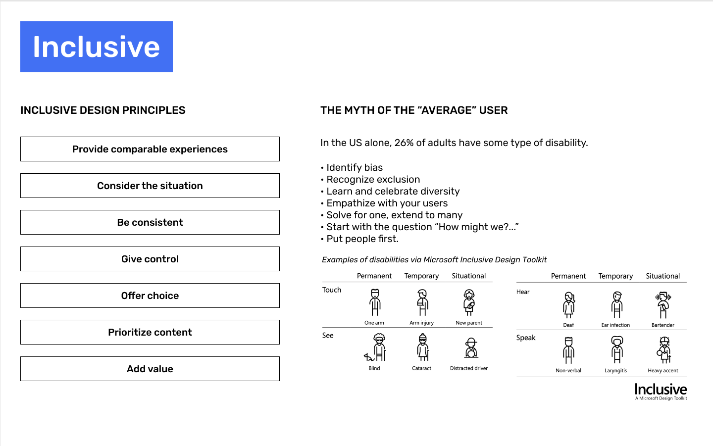
This led to an open discussion within the design team on how we could improve the product to give all users comparable, equitable experiences.
According to the CDC,
26% or 1 in 4 Americans suffer from some form of disability
As digital products become more prevalent in society, at ATM app we needed to consider how designs are interacted with by diverse groups of humans.
After the initial launch of the ATM app, the design team wanted to focus on creating an accessible and inclusive product for all.
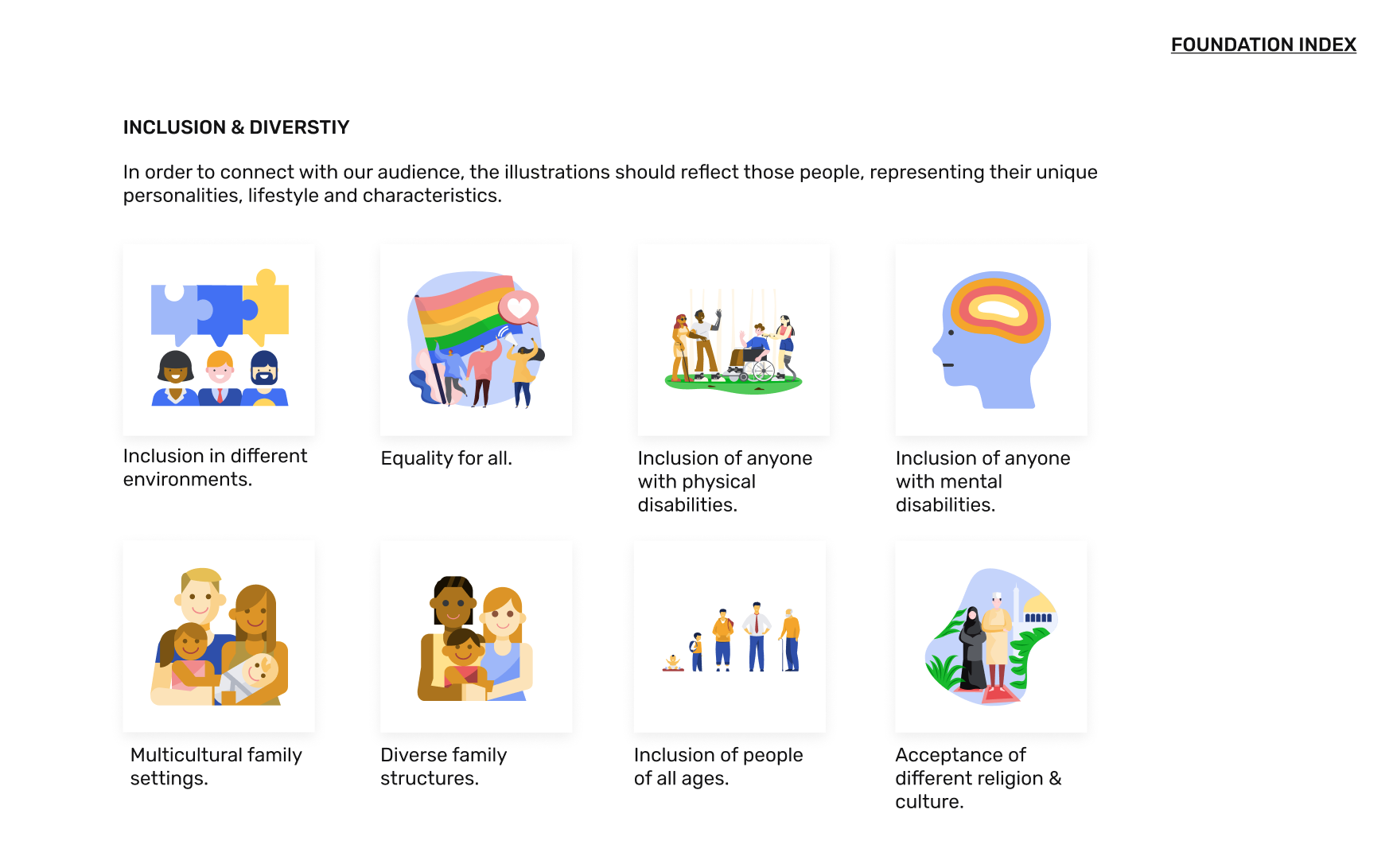
This led us to discover that there were various facets of the app that would not be considered accessible and inclusive, including:
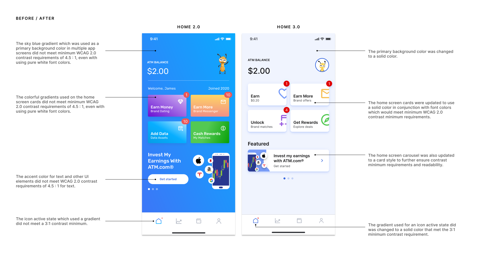
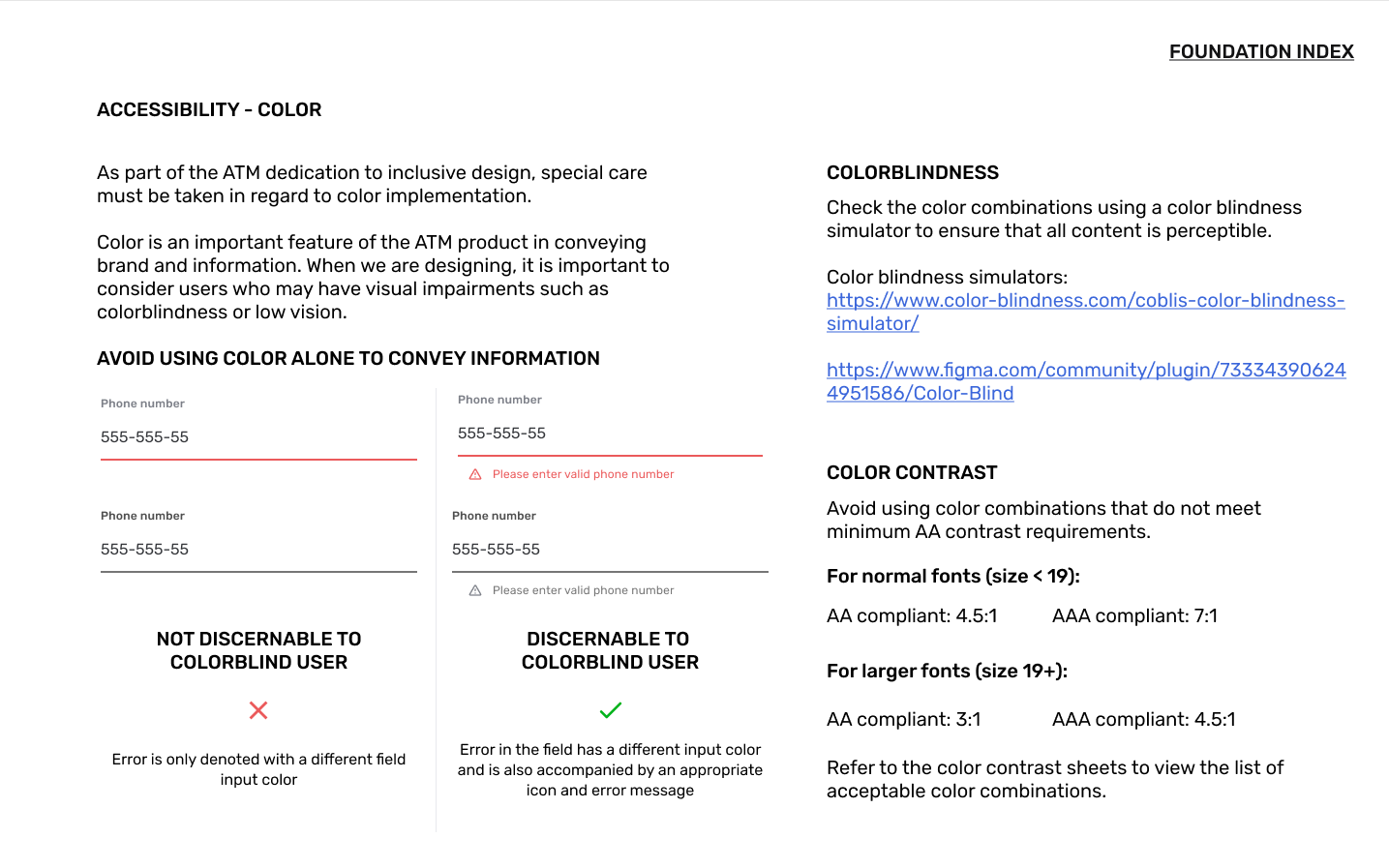
- Certain use of colors and typography
Approach
What was your process from initial problem to the final solution. What were the steps?
Research
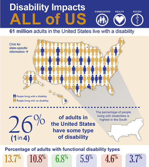
First I did some research on accessibility within the US to understand the prevalence of disabilities and extrapolate to the percent of users that might be affected on the ATM app. I was surprised to learn that 1 in 4 adults in America (61 million) suffer from some form of disability.
Based on the CDC research, I learned that these were some major functional disability categories:
- Mobility – 13.7%
- Cognition – 10.8%
- Independent living – 6.8%
- Hearing – 5.9%
- Vision – 4.6%
- Self-care – 3.7%
12
million people 40 years and over in the United States have vision impairment
1 in 12
men have some form of colorblindness
24.4
million is the increase in the number of people projected to have visual impairment / blindness (8 million) and correctable refractive errors (16.4 million) by 2050
Define
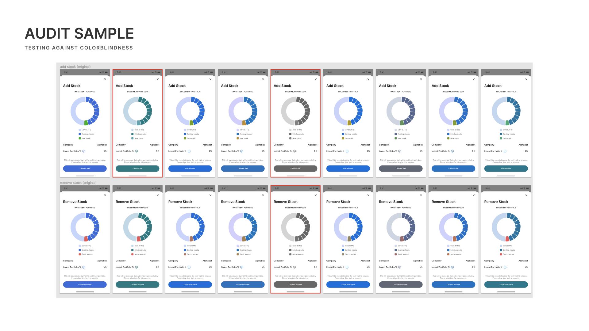
In the context of the ATM app, the design team decided to focus on the vision impairment facet of disability as it was most applicable to the product.
How might we design a product that is accessible by users of varying levels of vision impairment?
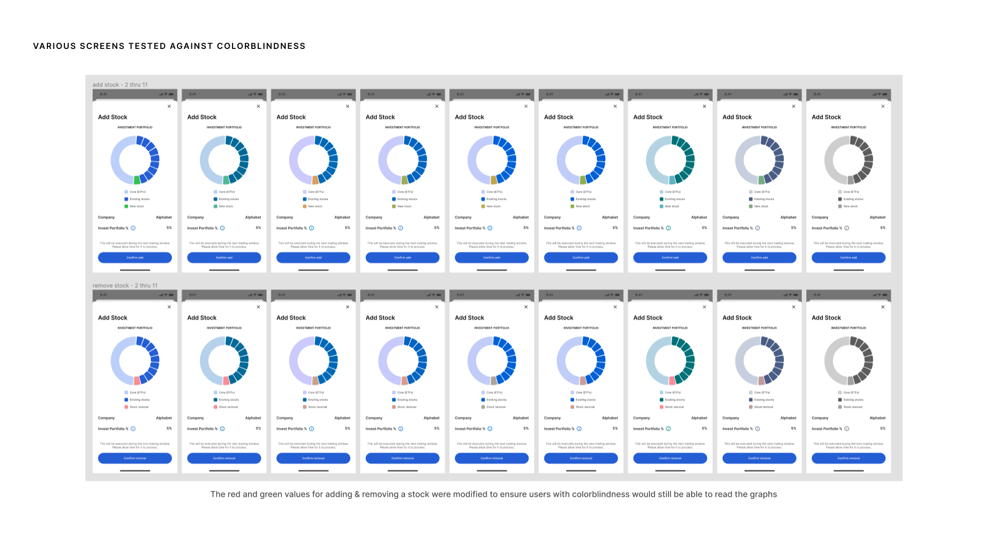
We limited the scope of this project to designs that might be affected by:
- Colorblindness
- Low contrast & low vision
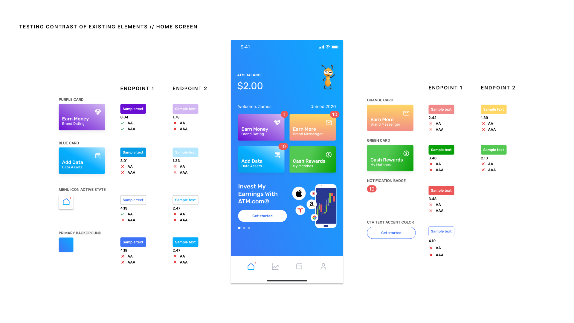
I led the research into Web Content Accessibility Guidelines (WCAG) color contrast accessibility and strategy for diversity and inclusion for the app.
3 : 1
is the minimum contrast ratio needed to meet WCAG 2.0 Level AA for large-scale text and icons.
4.5 : 1
is the minimum contrast ratio needed to meet Web Content Accessibility Guidelines (WCAG) 2.0 Level AA for normal text.
7 : 1
is the minimum contrast ratio needed to meet WCAG 2.0 Level AAA for text and icons.
Output
Design artifacts. Your role and specific contributions in the project.
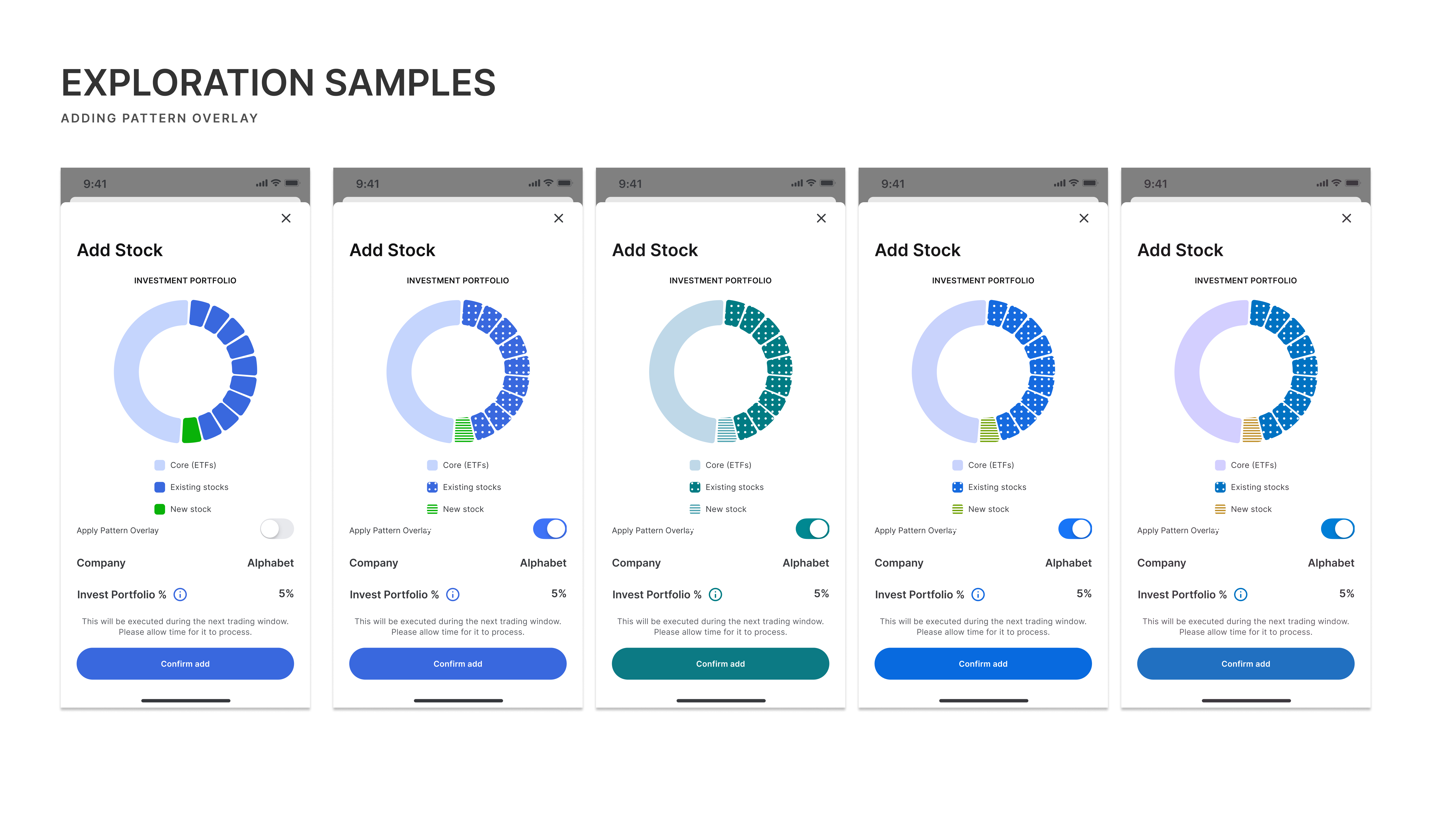
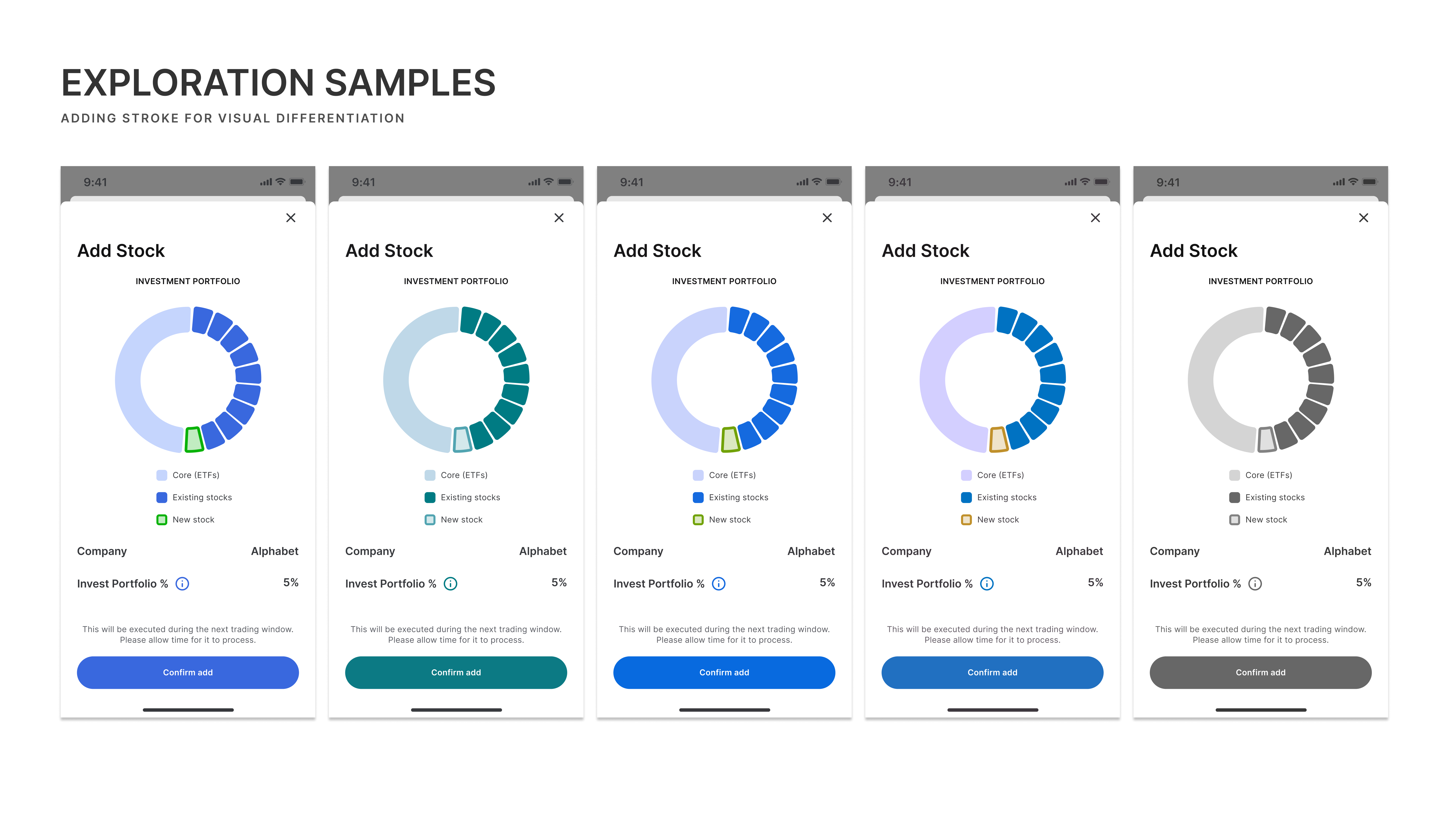
My role and individual contribution
- Led this initiative
- Research & strategy
- Introduced internal guidelines and documentation
- Re-mapping colors with accessible versions
Outcome
Success metrics & outcomes. What was the impact on the business or the users?
The outcome of this internal initiative is that the ATM app going forward will be designed in accordance with WCAG minimum contrast requirements and with consideration for varying degrees of colorblindness, making the app more accessible to more users.