ATM Design System 1.0
Context
Why this project started? What was the initial hypothesis? Who were you designing for? What was the timeframe?
The ATM design team was struggling to create new designs that offered a cohesive product design language in time for the MVP mobile app launch. The previous, sole product designer created the designs in Adobe XD without using components or libraries. Colors, typography, UI elements and more were all created and updated manually.
Team structure
This was an internal design team project led by myself with the guidance of Design Director, Ayo, and support from the Visual Designer, Terry.
Timeframe
Initial launch March 2020 – Sept 2020
Ongoing maintenance Sept 2020 – Feb 2022
Problem
What was the problem?
- There was a lack of clear design guidance for current and future designers. It was the wild west and every designer was designing as they pleased.
- There was a lack of cohesive ATM.com brand identity.
- Designers were spending inordinate amounts of time recreating and updating UI elements manually.
- Developers constantly needed to ask the design team for font/style pairings and colors.
- The old Adobe XD files could not be worked on simultaneously by more than one designer.
Approach
What was your process from initial problem to the final solution. What were the steps?
Discover
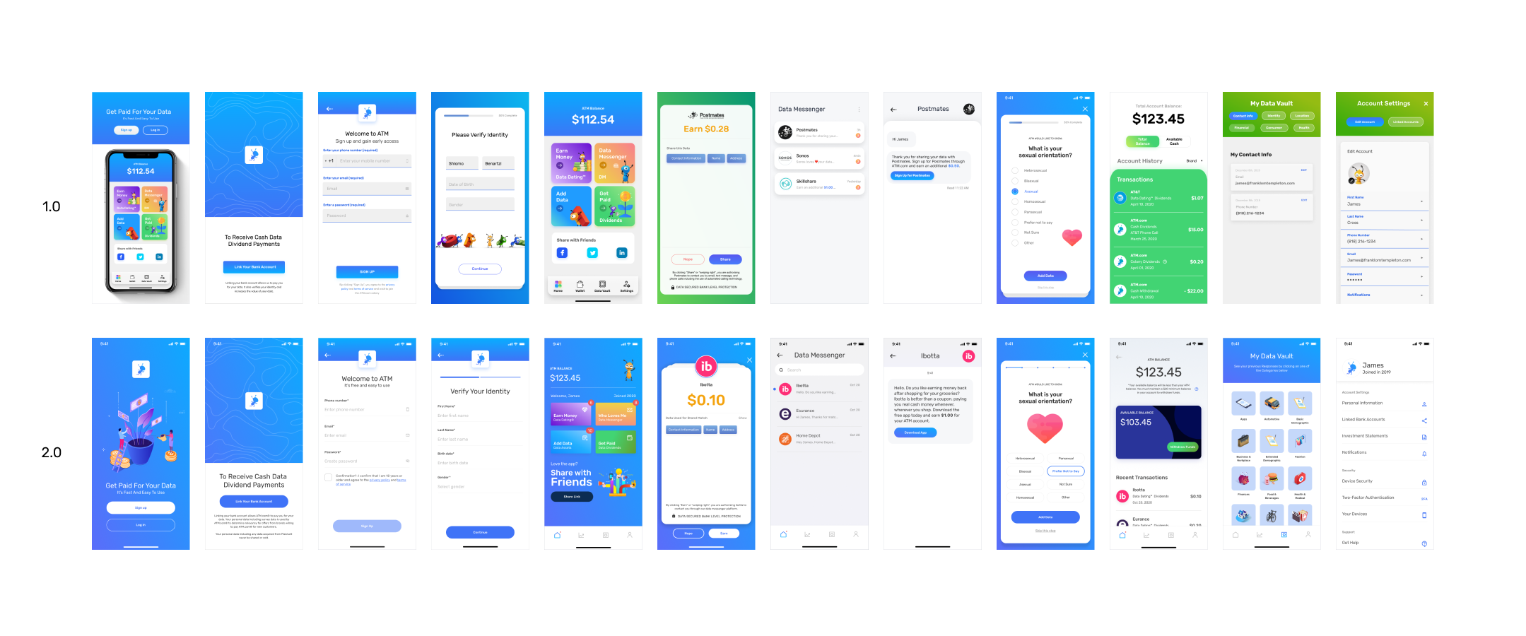
I interviewed Ayo, the Design Lead, on what the existing design process at ATM looked like. What I discovered was that previously, there was one other designer who worked alongside Ayo that created the majority of the Adobe XD files.
Each Adobe XD file was created ad-hoc and didn’t follow any particular content structure, layout, patterns, or components.
There was a generalized style guide for typography and colors but it was confusing to use and not well-documented.
Define
How might we create a design system that works for our team?
In this phase, the design team came together to agree on a minimum design system that would work for the launch.
We agreed to limit the scope of work to:
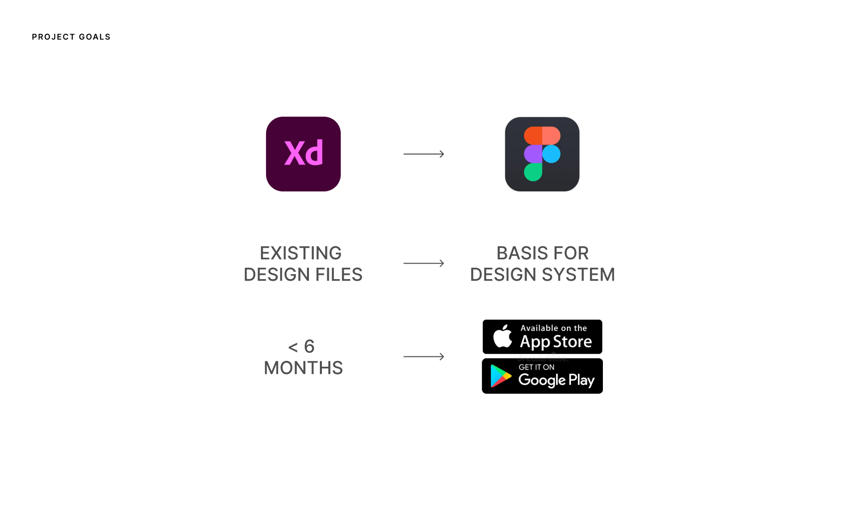
- Migrate existing design files to Figma
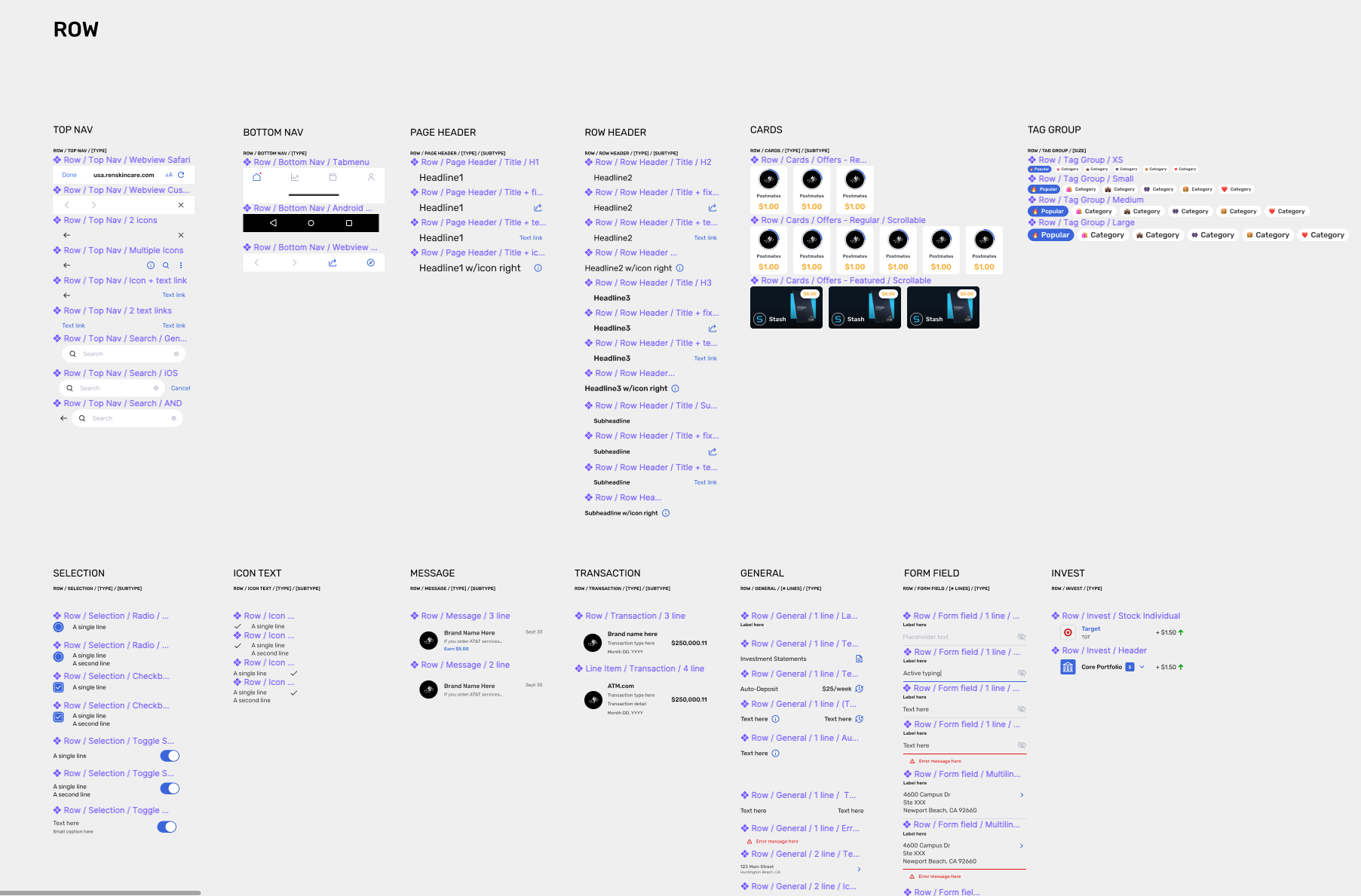
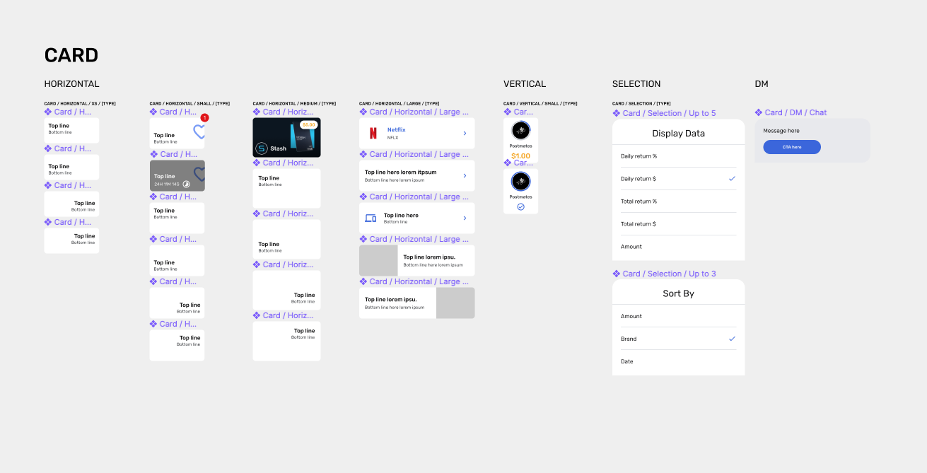
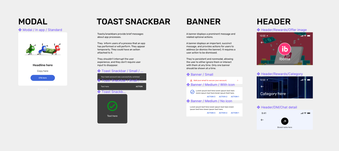
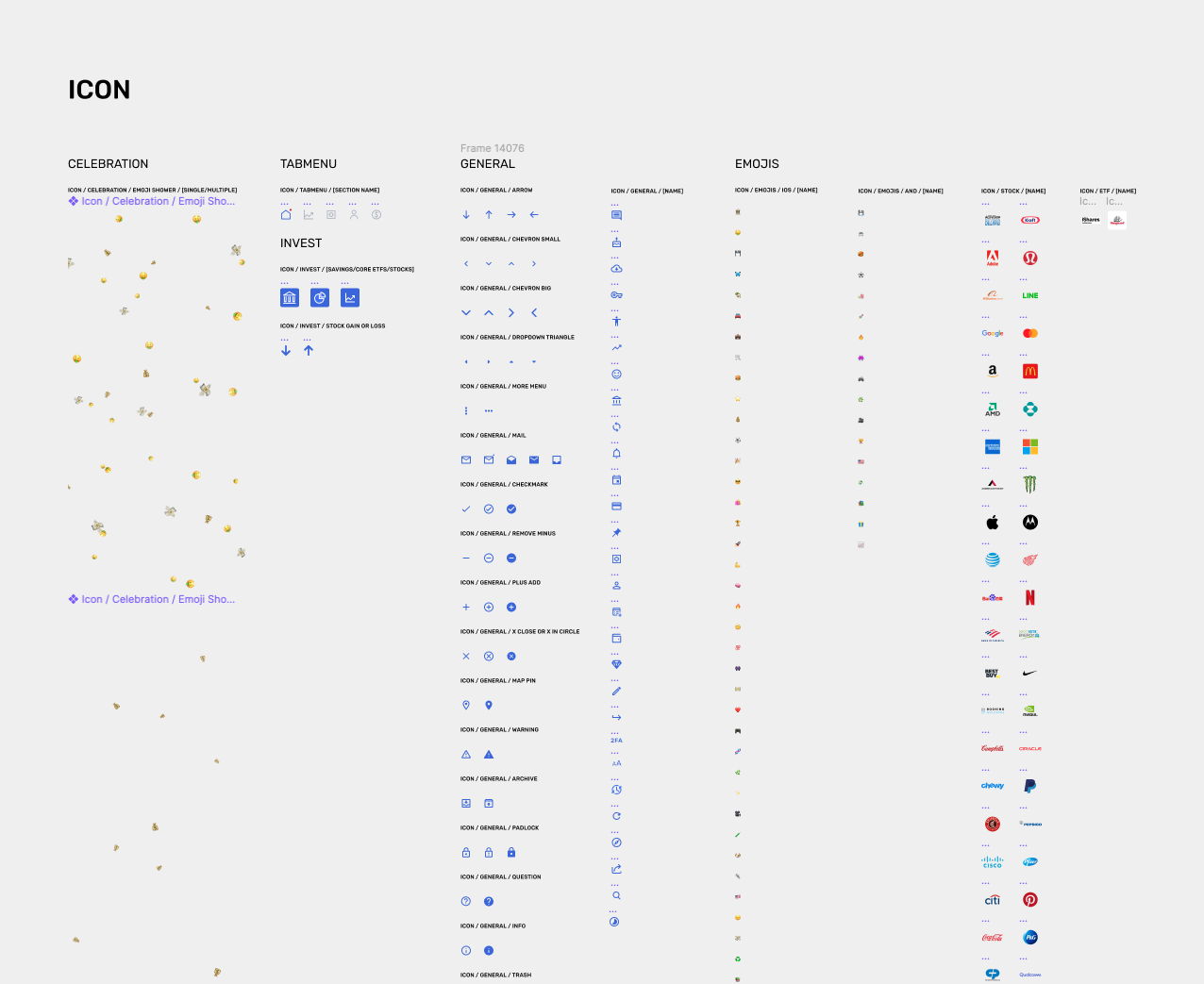
- Create UI libraries in Figma using the existing design files as a basis
- Launch the native iOS / Android app with a basic version of the design system within 6 months.
Explore
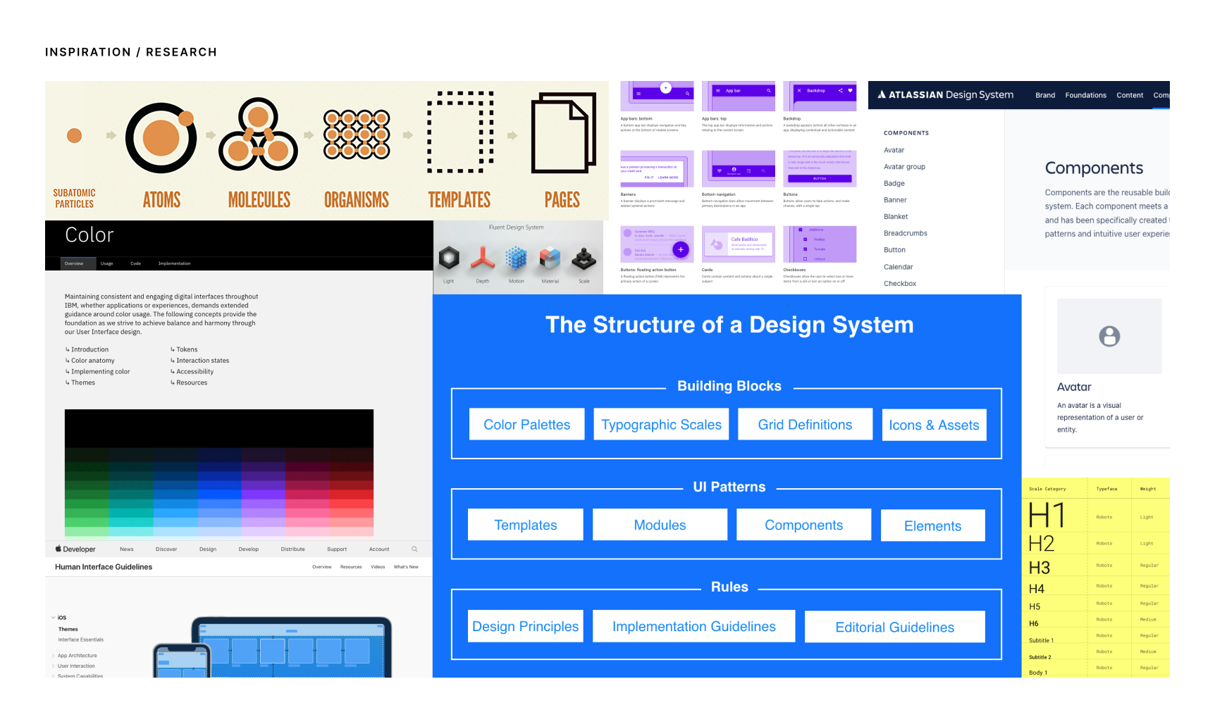
Atomic Design & other systems
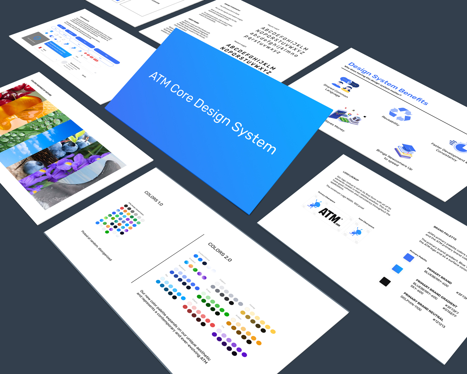
In my competitive analysis, I found that design systems used by large companies had a few things in common such as using atomic design principles where designs were broken down into smaller, scalable units/components. Colors being named by usage, instead of by their color value was a new concept that I stumbled upon as well. I learned later that having tokens for color and other UI properties was common for applying designs at scale.
Simplifying the noise
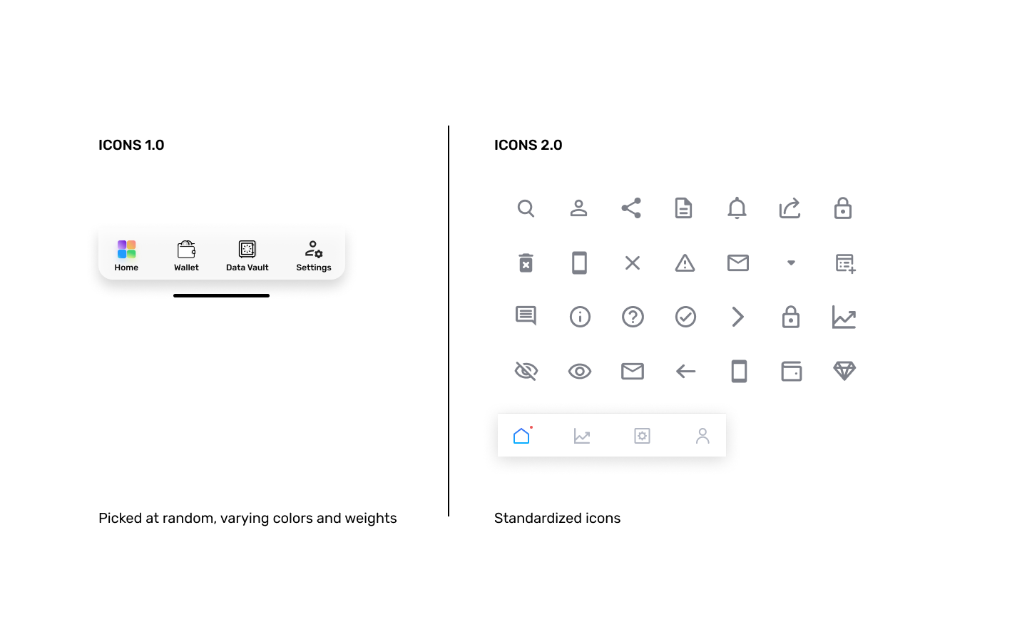
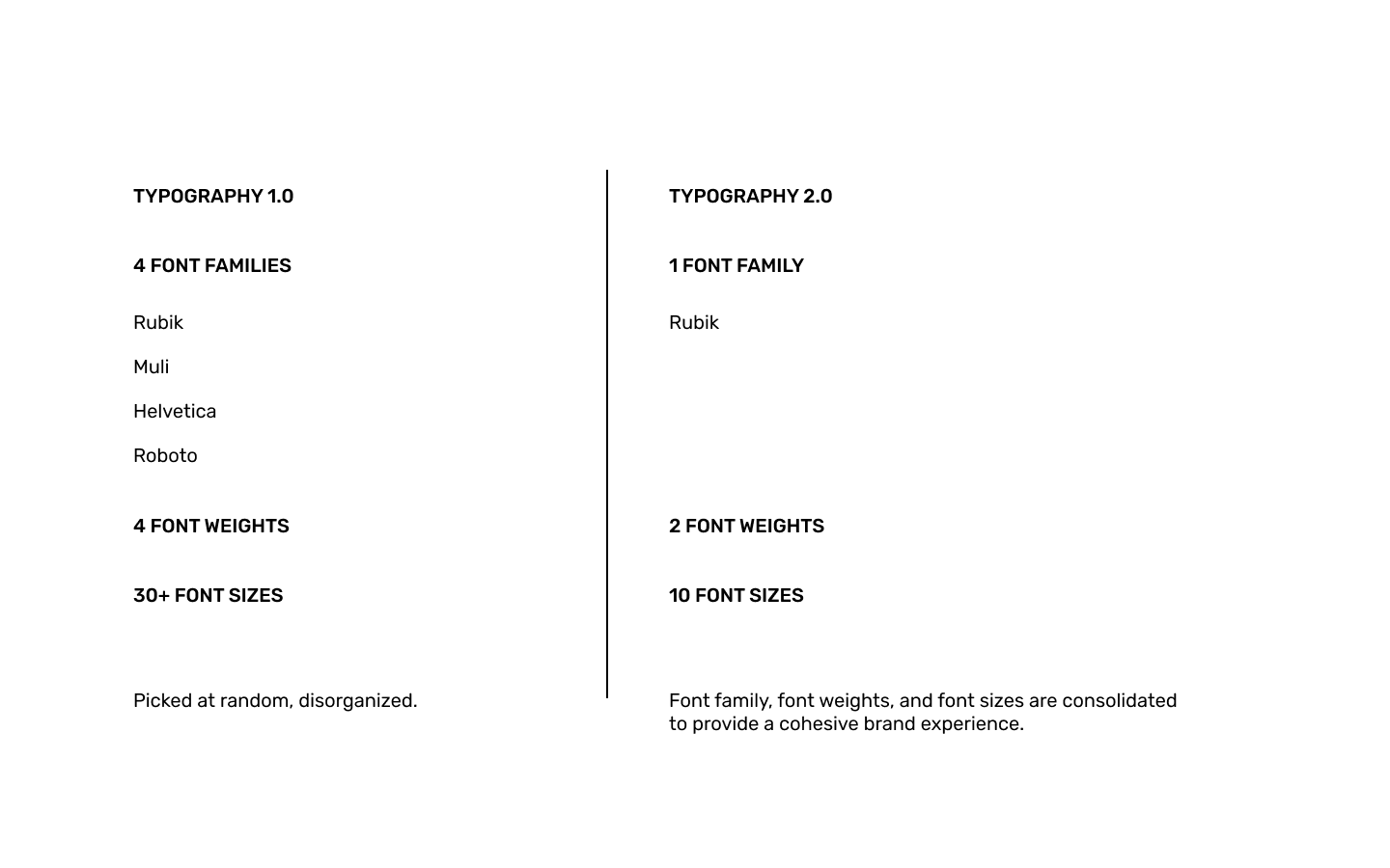
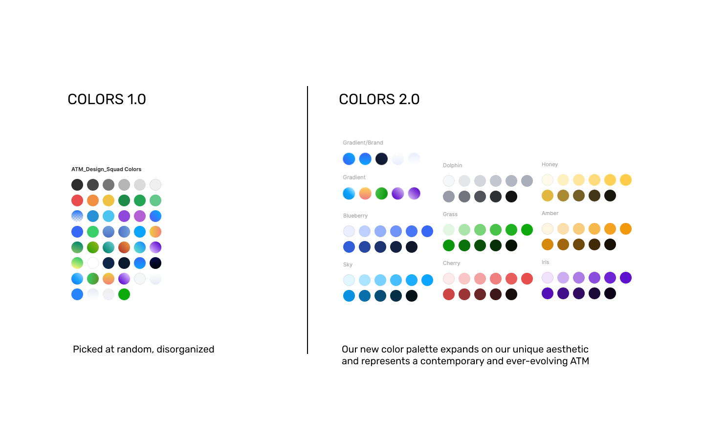
With the existing Adobe XD designs, it was clear that the typography, colors, and icons being used were picked at random, leading to inconsistency further down to the road when designers were trying to create new designs.
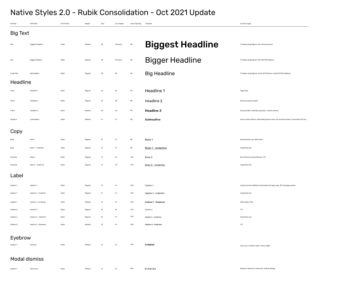
I proposed simplifying the typography to one font family for the native app and reducing the number of weights / sizes.
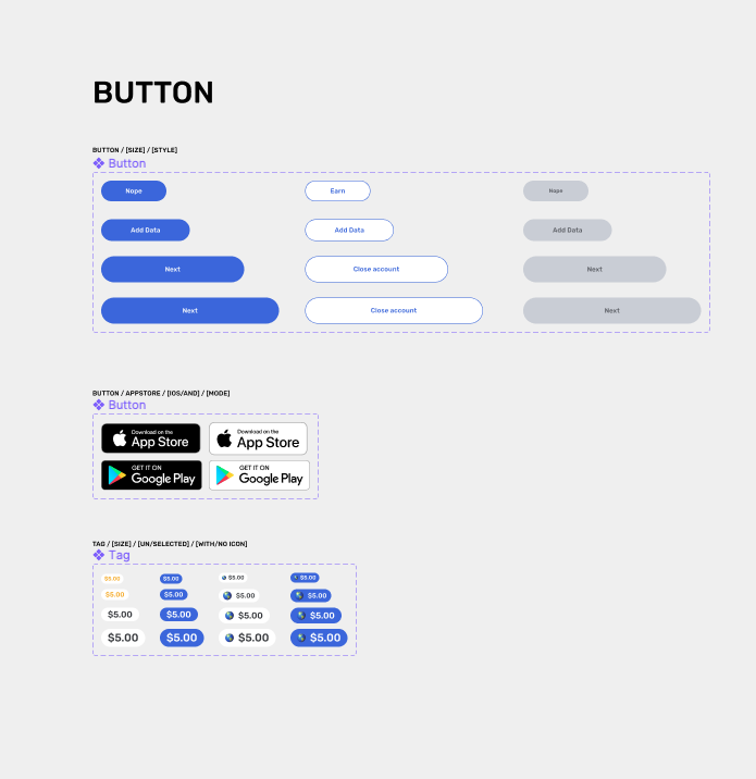
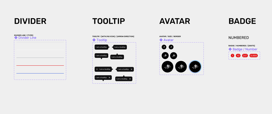
Similarly for the icon set, I proposed sticking to one set of icons to clean up the visual look and create a cohesive design language.
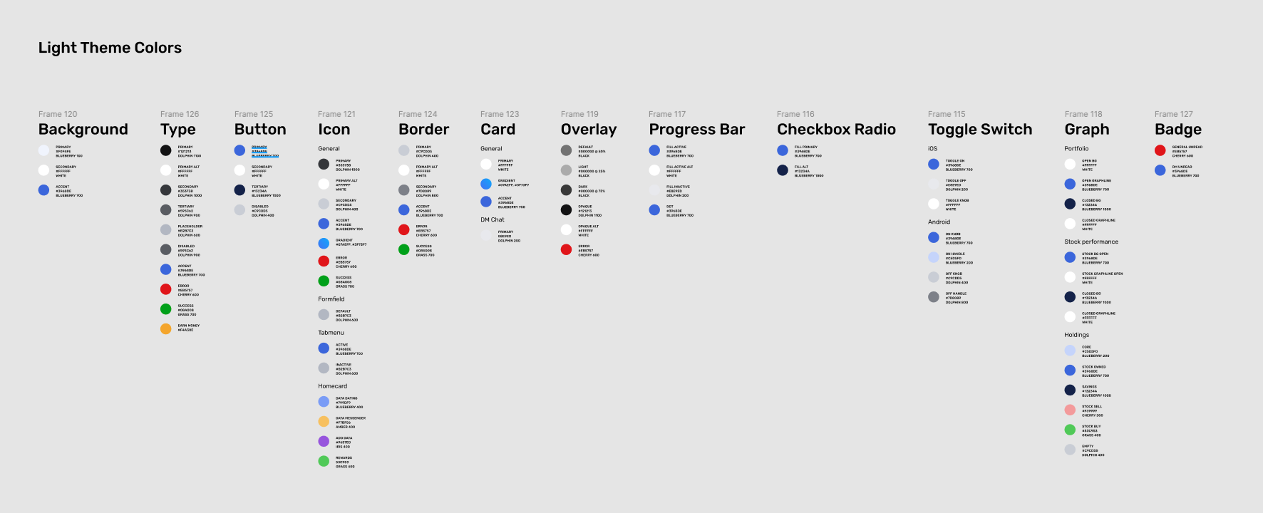
For colors, in my research, I found that in order to create distinct color themes (for example, for a dark mode), it was necessary to separate and identify colors not by their color name, but how they were used. I carried over this research by creating a “theme” for the native app that would pick from a global library of colors. The colors were then separated by element usage to ensure consistent application.
Output
Design artifacts. Your role and specific contributions in the project.
My role and individual contribution
- Led this initiative
- Competitive analysis
- Figma color library
- Figma typography library
- Figma UI component library
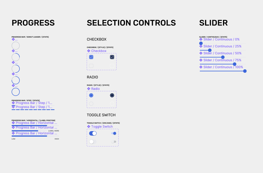
- 15+ pages of documentation for the design system
Outcome
Success metrics & outcomes. What was the impact on the business or the users?
- Increased output of design work and reduced hours spent individually updating UI elements with the use of reusable components & variants
- Standardized typography and icon set for easy handoff to the frontend engineering team
- Created guidelines that the design team could refer to, allowing more cohesive designs to come together and reducing confusion
- Launched the MVP native iOS / Android apps on time